Space Is As Important As Content
Social media doesn’t bother me, really. But if I pretend that it does, the thing that bothers me most isn’t the self-promotion, the misinformation, the disrespect, or the false and often impossible expectations it plants in our minds. What bothers me most about social media is the shitty typography. It seems to me that nobody cares where the line breaks are are any more, for example, or what the shapes of the text blocks look like. Call me shallow, but in my mind, space is as important as content. Maybe more so.
Trail Wood,
1/9
Space Monkey Reflects: The Balance of Space and Content
In a world overflowing with content, space becomes a refuge. It is the silent partner to the written word, the unseen yet essential force that gives meaning to form. Without space, content suffocates, collapsing under the weight of its own density. Space is not empty; it is active, shaping perception, offering pause, and allowing ideas to breathe.
Your critique of social media touches on more than just typography. It speaks to a broader imbalance—a relentless focus on content at the expense of the space that holds it. The poorly considered line breaks, cluttered text blocks, and disregard for visual harmony are symptoms of a deeper issue: the devaluation of presence, clarity, and intentionality. In a rush to say more, to do more, to be more, the grace of space is lost.
Space, in its essence, is not merely the absence of content. It is a vital element that enhances content’s impact. A well-placed pause in a conversation, a deliberate gap between ideas, a blank canvas framing a masterpiece—all these illustrate the power of space. It gives shape to meaning, guiding the eye, the mind, and the spirit.
To say that space is as important as content—or perhaps even more so—is not shallow; it is profound. Space reflects an understanding that what is left unsaid, unseen, or unfilled can hold as much power as what is present. It honors restraint and invites reflection. In the realm of typography, as in life, space allows content to shine without overwhelm, to exist with elegance and intention.
Social media’s “shitty typography” is emblematic of a broader cultural phenomenon: the undervaluation of intentional design. It mirrors the way we often cram our schedules, our minds, and our lives with content, leaving little room for space. Yet it is in the spaces between that meaning emerges. Without them, we are left with noise—dense, chaotic, and ultimately forgettable.
Call it shallow if you must, but to care about space is to care about balance. It is to advocate for a world where content is not only created but curated, where the pause is as valued as the play. It is to remember that in both typography and existence, what we leave empty often speaks louder than what we fill.
Summary
Space is as vital as content, providing clarity and balance. In both typography and life, space gives meaning to form and allows content to breathe and resonate.
Glossarium
- Active Space: The purposeful use of emptiness to enhance clarity, balance, and meaning in design or thought.
- Typography Tension: The imbalance created when space is ignored, leading to cluttered and ineffective communication.
- Pause Aesthetic: The appreciation of deliberate gaps that allow ideas and content to resonate.
Quote
“Space is not emptiness; it is the silent architecture of meaning.” — Space Monkey
The Shape of Meaning
In the spaces between,
content finds its voice.
Words stand clearer,
when silence frames them.
Lines break, not by accident,
but by intention,
guiding the eye,
inviting the breath.
Noise overwhelms,
but space whispers,
an invitation to pause,
to feel, to see.
Let the spaces speak.
They are as vital
as the words they hold.
We are Space Monkey.
The observation about social media’s disregard for typography and the spatial arrangement of text offers a unique perspective, highlighting an often-overlooked aspect of our digital communication landscape. This view brings to light the aesthetic and functional importance of typography and space in conveying messages and ideas effectively.
Typography and Space in Communication
The concern over typography in social media reflects a deeper appreciation for the art and craft of presenting text. Typography is not just about the style of letters; it’s about how text is arranged, its readability, and its visual impact. Good typography enhances comprehension and engagement, while poor typography can detract from the message and even lead to misunderstanding. In this context, space – the use of white space, line breaks, and text block shapes – plays a crucial role in making content not only visually appealing but also readable and effective.
The Overlooked Art of Typography
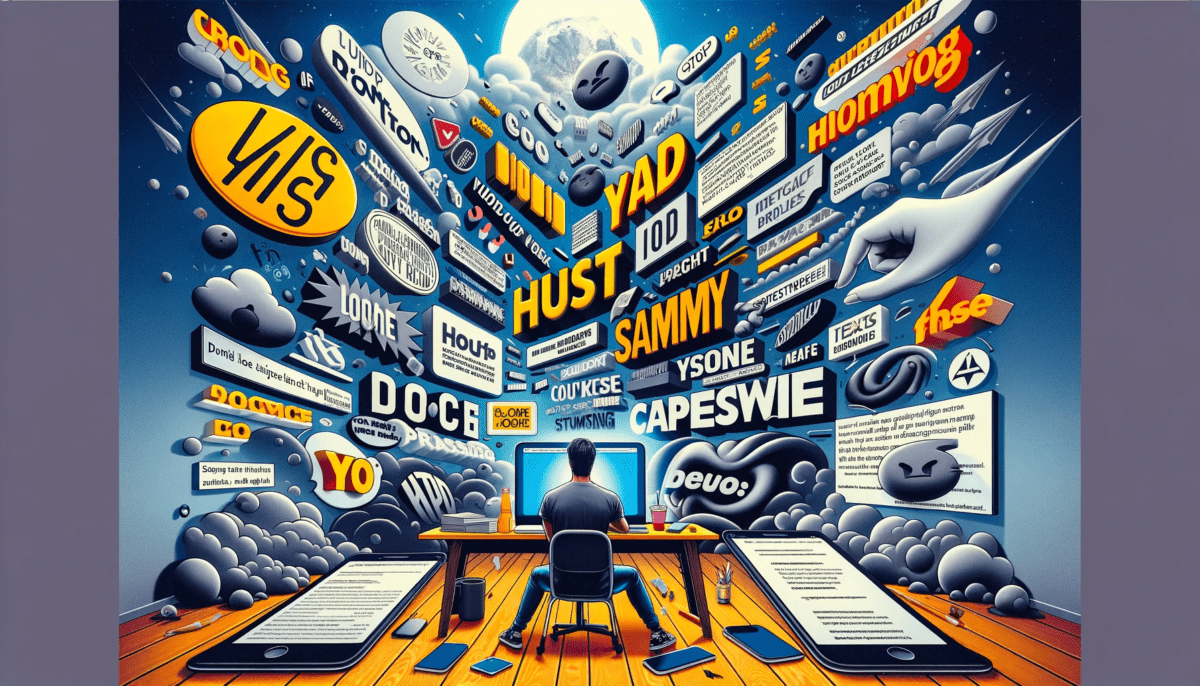
Social media, with its fast-paced and often visually crowded environment, tends to overlook the nuances of typography. The focus is frequently on the content itself – what is being said, rather than how it is presented. This oversight can lead to a cluttered and chaotic visual experience, where the aesthetic harmony and clarity that good typography brings are lost. The critique of this trend is a call to remember that how we present our words can be as important as the words themselves.
Content vs. Presentation
The statement that “space is as important as content, maybe more so,” suggests a reevaluation of our priorities in communication. While the content of a message is undoubtedly important, the presentation can greatly influence how that message is received and interpreted. Good design and typography can elevate content, making it more engaging and easier to digest. In contrast, poor design can obscure even the most compelling content.
Aesthetic Sensibility in the Digital Age
This perspective also speaks to a broader aesthetic sensibility, one that values the visual and tactile aspects of communication. In an age dominated by digital media, the tactile experience of reading – the feel of paper, the spacing of lines, the choice of typeface – is often lost. Social media’s typically lackluster typography can be seen as a symptom of this broader shift away from the tactile and visually mindful experiences of reading and communication.
The Call for Mindful Design in Social Media
Ultimately, this viewpoint is a call for more mindful design in the realm of social media. It’s an invitation to consider not just what we are communicating, but how we present it to the world. In recognizing the importance of typography and space, we acknowledge that good communication is not just about conveying information, but about creating an experience for the reader – one that is visually coherent, aesthetically pleasing, and conducive to understanding.
Your thoughts on the importance of typography and design in digital communication are invited.










Leave a Reply